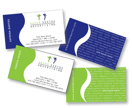
People are ten times more likely to keep business cards riddled with colour than one that’s just black and white, according to experts. This makes sense, as colours can make a big impression on us. They can influence how we feel and perceive things, so why not make a potential customer or client feel something when they look at your business card? If you’re starting to feel overwhelmed by the number of possibilities, don’t worry, this article will help you choose the right colour scheme for your business cards.
Understanding Colour Theory
The way colours are combined when branding isn’t a coincidence, there’s a science behind it. Using colour theory, we can see how colours best compliment one another, how they are mixed and where they fall on the colour wheel. Understanding all this will help you choose the best colours to represent your business.
Determining a colour scheme for your business cards can be as easy as picking a colour off a colour wheel and building from there. Once that’s been determined, you can grow from there. Decided on purple but don’t know where to go from there? Try grouping analogous colours (three colours side by side), complementary colours (two colours opposite one another) or triadic colours (three colours equally spaced around the wheel). This will result in you finding a colour scheme that works best for you.
The Psychology Behind Colour
Choosing the right colour sends a message about the kind of business you’re running. Each colour conveys something different that will ultimately impact on how your business cards, and business as a while, are perceived. Here’s a quick breakdown of the meaning behind each basic colour. Red represents physical, youthfulness and boldness. Orange implies cheer and overall confidence. Yellow portrays optimism, warmth and happiness. Green conveys peace and health. Blue embodies strength and dependability. Purple personifies independence and creativity. Lastly, grey symbolizes neutrality and a sense of calm.
How does this help you design your business cards? Well, what do you want your business to convey to others? Maybe you’re a lawyer who strives to defend their clients by any means necessary. Then you might want to think about incorporating reds and blues into your card, to convey your bold and dependable nature. Or maybe grey and orange to show that you have a calm presence while being confident in your ability to win a client’s case.
With that being said, don’t try to incorporate too many colours. You want colours that fit your brand and catch the eye without being overwhelming. Whatever colour scheme you choose should be carried out throughout your entire brand to keep your message consistent.
Located in Coquitlam, BC, Toukan Printing has the latest printing machines for all our products, manufacturing a variety of high-quality printed media. Proud of our high efficiency in getting order after order out to you, we’re a one-stop shop for all things print related, guaranteed to have what you’re looking for, including business cards, flyers, door hangers and more. With great customer service, we will work to exceed your expectations every time. We’re committed to providing you with beautiful prints at a great price, so call us today for a same-day quote.


