How to Prepare Your Files for Commercial Printing: A Pre-Press Guide
A technical pre-press checklist for designers and business owners. Learn how to properly set up your artwork files to ensure perfect color, resolution, and cutting for your commercial print runs.
Quick Answer: What makes an artwork file "print-ready"?
To ensure your commercial printing job goes directly to the press without delays or formatting errors, a file must be strictly "print-ready." This means it includes:
- CMYK Color Mode: Optimized for physical ink, not digital screens.
- High Resolution: Minimum 300 DPI (Dots Per Inch) at the final print size.
- Proper Bleeds: A minimum 0.125” bleed extending past the cut line.
- Outlined Fonts: All text converted to vector shapes to prevent missing font errors.
- Correct File Format: Exported as a high-quality PDF.
Nothing is more frustrating for a marketing manager or graphic designer than receiving a massive commercial print order only to realize the colors are muddy, the logo is pixelated, or important text was chopped off the edge.
While Toukan Printing always requires final artwork approval before production begins, knowing how to set up your files correctly from the start saves days of back-and-forth communication. Here is exactly how to prepare your artwork for our Port Coquitlam presses.
The Golden Rules of Pre-Press Setup
1. CMYK vs. RGB Color Profiles
Your computer monitor displays colors using light (RGB: Red, Green, Blue). Commercial printing presses create color by laying down physical ink (CMYK: Cyan, Magenta, Yellow, Key/Black).
RGB has a much wider color gamut than CMYK. If you design a bright, neon green brochure in RGB and send it to print without converting it, the press will automatically convert it to CMYK, resulting in a dull, muddy green.
Always start your design document in CMYK mode.
2. Mastering the Bleed and Safe Zone
Industrial paper cutters are incredibly precise, but slight shifts (up to 1/16th of an inch) can occur during the trimming process.
- The Bleed: You must extend any background colors or images 0.125" past the final trim edge. This ensures that if the blade shifts slightly, you don't end up with a highly visible white border along the edge of your flyer or label.
- The Safe Zone: Keep all critical text and logos at least 0.125" inside the final trim edge so they don't risk getting clipped.
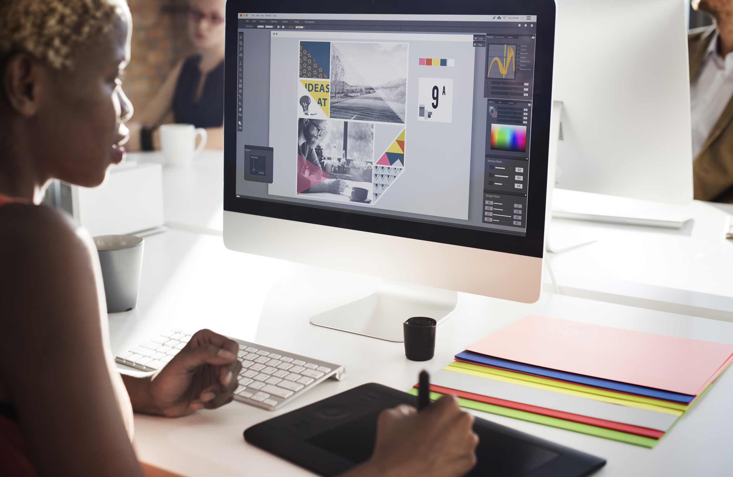
3. Image Resolution (300 DPI) Images pulled from websites are usually 72 DPI, which loads quickly on screens but looks blurry and heavily pixelated when printed. For crisp, professional commercial printing, all raster graphics (photos) must be at least 300 DPI at the exact size they will be printed.
The Value of Local Quality Control in BC
Even with the perfect file setup, having a local set of eyes on your project is invaluable. Massive online printers automate their entire intake process; if your file has an error, their machines will print the error. At Toukan Printing in the Tri-Cities, our pre-press team physically reviews your files. We look for missing bleeds, low-resolution warnings, and color profile mismatches, flagging them for you before a single drop of ink is wasted.
Submit Your Print-Ready Files Today
Ready to get your project on the press? Toukan Printing Ltd. specializes in high-quality commercial printing services for the Lower Mainland, from custom labels to large-format banners.
Visit or Contact Toukan Printing Today:
- Location: 5-2054 Kingsway Ave., Port Coquitlam, BC V3C 1S5
- Office Phone: +1 (604) 710-5234
- Mobile/Direct: +1 (236) 480-2333
- Email: info@toukanprinting.com
Frequently Asked Questions: Preparing Print Files
Why do my brand colors look different on paper than on my screen?
Screens are backlit, making colors appear much brighter and more vibrant than they will on paper. Additionally, every monitor is calibrated differently. The only way to guarantee absolute color accuracy is to request a physical press proof from our Port Coquitlam facility before running the full job.
What is the best file format to send to a commercial printer?
A high-resolution PDF (Portable Document Format) is the gold standard for commercial printing. It locks in your formatting, embeds your images, and maintains your vector data perfectly. We generally do not recommend sending raw design files (like .INDD or .AI) unless requested, as linked images and fonts can easily be lost in transit.
What does "outlining fonts" mean?
If you use a specific, custom font in your design and we don't have that exact font file installed on our pre-press computers, our software will automatically substitute it with a standard font (like Arial), ruining your layout. "Outlining" or "rasterizing" your fonts converts the typed text into fixed vector shapes, completely eliminating the risk of font replacement errors.
forum Discussion (0)
Be the first to share your thoughts!